Phase One: Building a Home Bakery Studio
If your dreams don’t scare you, they’re too small.
Concept Board for my bakery studio
The Project
Last summer I did a whopping 20 weddings out of my home kitchen. That’s a lot of buttercream, cake, and cookies, friends. A very large workload, managed with one oven, one fridge, one mixer, and 6 feet of counter space. Not to mention, I have a large family who also use the space. It’s our kitchen after all, the most utilized space in the house. Snacks, school projects, making dinner- everyday life, happening in the middle of my baking madness. To say it was stressful is a grand understatement.
Tears (mostly mine) were shed. I love this little kitchen, it’s adorable, but my business is growing, and something had to give.
My home kitchen. Photo by Lindley Rust Photo
The Solution
Our house is a genuine farmhouse, built in the 1920’s. It was built for convenience, not style; necessity, not size. While it’s bursting with cozy, country charm, the rooms are small and the hallways are long and narrow. I’ve always dreamed of a sun-filled open floor plan concept, but I’ve accepted that won’t open unless we’re ready for a major overhaul, which we’re not. A room in the house will need to be sacrificed for the greater good. I’m making the best with what I’ve got and getting clever.
Luckily for me, part of the old-fashioned 1920’s farmhouse design is the formal living room that no one ever uses. It’s essentially a wasted room that is too small for the big family sectional, so it just sits empty, collecting dust, unless it’s Christmas morning. In our house, that formal living room sits right across from our existing kitchen and mudroom, making it an ideal location for a bakery.
This room is the perfect size, it’s close to plumbing, it has decent wall space for shelves and counters, and it has the right amount of natural light to feel bright and airy. It also has exterior doors for a separate entrance for clients to attend cake tastings, host workshops, or pick up cakes. But the biggest bonus, it doesn’t need a major tear down, which saves on money and time. It’s purely a surface remodel. The other money saver, I happen to be married to a builder who will be doing all the construction.
My designer head is spinning!
My farmhouse inspiration for the bakery.
The Concept
My business involves everything from making wedding cake, to tutorials, to hosting workshops. The space doesn’t need to fit commercial standards, but it does need to have some commercial elements. After all, I do sell my goods. I need a space that functions as a working bakery, a photography and video studio, and has genuine farmhouse style to fit the rest of my home.
Here’s my check list:
I need durable, smooth, easily cleaned surfaces to create beautiful cakes and cookies.
Storage for my cake stands, cook books, mixing bowls, cake pans, etc. Baking supplies take up a lot of space.
Seating for clients.
I want a genuine farmhouse look that compliments the history of my home, but also feels modern, clean, and commercial.
High quality appliances.
Large sink to clean heavy duty mixing bowls.
Light and bright surfaces that will photograph well.
Easy, right? Not quite. How do you mix cozy, earthy, and natural with working commercial function? My head immediately goes to stainless steel, marble, and butcher block for function, and patterned tile, shiplap, and open shelving for style. I’m going to mix modern durability with rustic warmth to create my dream space. I’ve never seen it done, but that doesn’t mean it won’t work.
To create a cozy, quaint country home feeling, I selected wall surfaces and lighting with color, pattern, and texture. Unique shapes, aged finishes, and warm tones make the space feel inviting and lived-in. These elements add character to the room.
The above selections are from The Cement Tile Shop and Rejuvenation. See notes for more details.
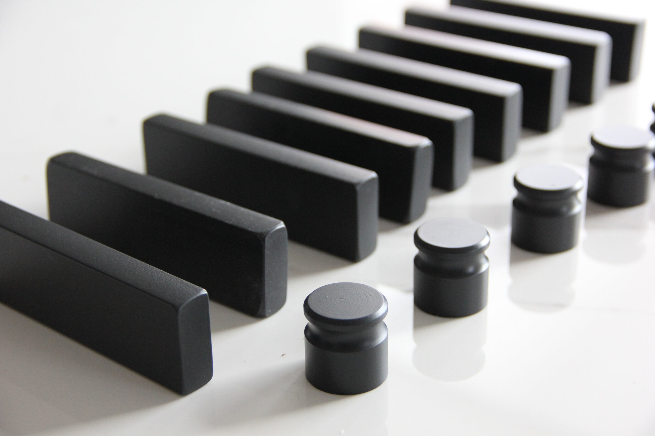
To create a space with clean-lined modern function and durability, I selected furnishings, hardware, and appliances with high quality engineering and materials that will hold up to wear and tear, while still looking stylish and elegant. Stainless steel, black iron, wipeable leather, and smooth marble composite blend seamlessly with the surrounding rustic elements, but have practical use in the room.
The above selections are from Room and Board and Kitchen Aid. See notes for more details.
Jeremiah and Killian adding hardware to the cabinets.
The Process
Everything is ordered and the project is underway. Here’s a sneak peak at the process of the build. Jeremiah did 100% of the work himself, with the occasional help from Killian. We’ve run into our fair share of 1920’s farmhouse quirks, but so far, I’m loving how it’s looking. I think it’s going to be the answer to my prayers.
See the finished room here!
Love how this patterned cement tile wall and shiplap came out.
Barnwood plank shelves have gone up.
Ceiling lights are installed.
Kitchen Aid appliances have been installed.
Designer notes and shopping guide:
Cement Wall Tile from The Cement Tile Shop in Josephine Pattern.
Antique Turquoise Pendants from Bellacore.
Semi-flush Eastmoreland light fixture from Rejuvenation.
Lantern tile mosaic in Black from Supreme Tile.
Jute Runner Rug from Magnolia Hearth and Hand.
Pike Barstool in synthetic leather from Room and Board.
Portica Counter Table with Marble White Ceramic Composite Top from Room and Board.
Fredrik Modern Pulls in Graphite from Room and Board.
Stanwell Knobs in Graphite from Room and Board.
Kitchen accessories from Room and Board.
Stainless Steel French Door Refrigerator from Kitchen Aid.
Stainless Steel Double Wall Oven from Kitchen Aid.


